PHOTOGRAPHY
ECAL x AREA OF WORK - CO-EXISTENCE
with
Area Of Work,
Milo Keller
ECAL/University of Art and Design Lausanne has teamed up with Paris-based studio Area of Work at Paris Photo to present CO-EXISTENCE, a monumental immersive installation in the heart of Paris’s 11th arrondissement, from 7 to 9 November 2024.
In a large metropolis, a small, seemingly empty apartment reveals discreet traces of human presence. On another scale, a conquering population manifests itself. Wings flap, slime trails, antennae shivers...
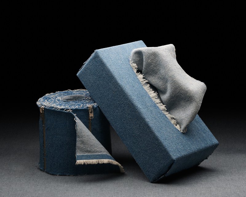
In the industrial setting of the former Garage République in the 11th arrondissement of Paris, CO-EXISTENCE showcases a living cohabitation through a sequence of artificial images created using Computer Generated Imagery (CGI). These spectacular yet intimate photo-realistic projections highlight the imperceptible, the infra- thin, and the invisible, blurring the scales between micro and macro.
Developed during three series of workshops conducted from 2023 to autumn 2024 by Area of Work, CO- EXISTENCE bears witness to the technical and artistic skills that are honed within the ECAL MA Photography. These workshops enabled students to transpose their photographic skills into the virtual space of 3D graphics to understand the temporal, artistic, and commercial issues involved in creating CGI.
‘This collaboration offered ECAL students an introduction to the tools and possibilities of 3D graphics, exploring their integration into the processes of creating photorealistic and hyper-realistic images, while highlighting the importance of the artistic and cinematographic dimensions that are at the heart of our identity.’ – Amine Ghorab & Scott Renau, Area of Work, Paris.
Founded in Paris in 2018 by artists and directors Amine Ghorab and Scott Renau, Area of Work is known for its distinctive contemporary visual narratives, blending graphic framing and rigorous photographic direction. Specialising in fashion, luxury, and technology, the creative studio has become a major player in contemporary visual storytelling..